The Circular Opportunity: African Stories: How We Made It
We’re still buzzing from our latest project launch and wanted to share the behind the scenes story. This project was a great example of something that started with just an idea and a desire to contribute to the circular economy community. So just like on the African Stories site, let’s start an adventure, and discover how we built it.
1 The idea
At HappyPorch, we’re really committed to value-based projects, especially in the circular economy. And as a Certified B Corp™, doing pro-bono work that benefits the community is also an integral part of what we do. Footprints Africa is a non-profit organisation that’s on a mission to advance sustainable, scalable and inclusive approaches to development of local African economies. The African Circular Economy Network (ACEN) is a non-profit that aims to promote the African Circular expertise within the continent and from Africa to the rest of the world. And when we first spoke about collaborating on a future project together, it felt like a perfect fit. Even though none of us knew what that project would be yet!
Footprints has a nice collection of African circular economy case studies. We thought that this project could take those case studies to the next level by building an interactive online stories platform where users can virtually experience the stories by taking a journey across Africa.
Our first project description
The user might choose:
- to quickly experience many short stories on a pre-selected virtual journey
- a theme (e.g. plastic or agriculture or an African region)
- to create their own personalised itinerary
After selecting, the user ‘travels’ around an animated map of Africa. At each ‘stop’, they will be shown a visual taster of the story. Each story will be told by a local ‘virtual guide’, presenting it in an engaging and relevant way.
The virtual traveller can also choose to provide questions and feedback, share their favourite stories via social media, or even invite others to travel the same virtual journey.
It’s funny now how close we stayed to the core idea while ditching “extras” like the virtual guide. Now that we had a pretty clear description of the project, we started doing lots of research and brainstorming on the UX, handling the data, making the platform fun and engaging, planning community outreach, and marketing. We were also really inspired by existing online virtual journeys, like David Attenborough's Great Barrier Reef and the map in Indiana Jones!
Getting Ready for Kickoff
The Kickoff Call was our first opportunity to set a great impression with Footprints and ACEN and start this project with high energy. We also wanted to use the call as an opportunity for us to get very clear on the projects' objectives and what the next six months would look like.
To get that level of clarity and make the kickoff feel engaging for everyone, I wrote some starter objectives and asked questions like these:
- Why is this work important to the larger community and us?
- Do these objectives represent our purpose?
- How can we improve them?
- What does a successful project look like to all of us?
- What press release would we like to have when the project launches?
Those questions started thought-provoking conversations that helped us get a set of OKRs that everyone understood and consented to.
Objective 1
To enable people of different backgrounds and means to learn and experience the diverse ways people can contribute to the Circular Economy and be inspired to take action.
Key Results
- Easy to add case studies
- Engaging user journey
- Quizzes to check users' understanding and inspire action
Objective 2
To generate international awareness of the work currently being done by CE entrepreneurs in Africa and work done by ACEN and Footprints.
Key Results
- CE entrepreneurs are represented in a way that celebrates their stories while also being honest about challenges
- Advisory board to check representation and generate interest
- social media sharing templates
2 UX and Design
With those objectives in mind, we started thinking about the user experience (UX). Who will be using this site and how can we make using it a fun and easy experience for them? How can we make a cool and interactive site that we can realistically build in a short time with limited capacity? What were the common themes about the immersive storytelling platforms we loved? How does storytelling work in games? Who are we building this for and what would they need to understand the site?
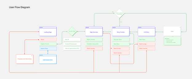
We started with a rough draft of what the user flow might look like and did a lot of research into storytelling best practices, especially storytelling in games. We wanted users to really empathise with the case study stories when they read them, but we were also unable to edit the case study content. So we thought about structuring the stories in a way that reflects Freytag’s Pyramid: exposition, rising action, climax, falling action, and resolution.
We also looked into a guide character, something that could give an overall purpose and structure to the journey. But we were careful not to make something like Clippy. Eventually we remembered to keep the scope small and simple, and a guide character might appeal more to a younger audience anyway. So while we were limiting the scope, we decided to leave the map element out as well.
Design Iterations
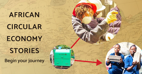
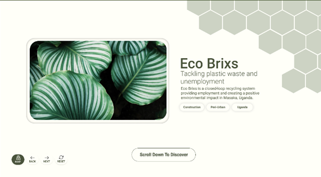
We went through a lot of design iterations before we got this right. We knew that we wanted the site to have a low digital carbon footprint, so we wanted to keep the images small. And at first, we wanted to use a muted and earthy color scheme.
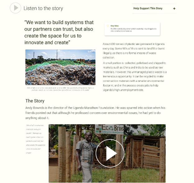
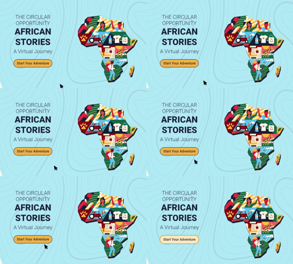
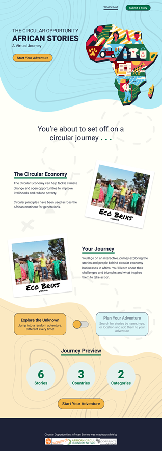
Later on, we saw a beautiful illustration of Africa designed by MUTI for the African Youth Survey. We were very inspired, and it completely changed how we wanted to do our colours. We also started having regular design consultations, which were crucial in refining the look and feel of the design. We dropped a literal map and used contour lines and trail designs to evoke the feeling of going on a journey. We added a toggle on the home page to add a fun level of interactivity and function. We carried on the theme of journeys by framing the images as Polaroids and map pins in the navigation. From the user perspective, we wanted it to be effortless for them to always be aware of where they are and how to move forwards and backwards along the journey.
None of us on the team are “designers” exactly. Typically, when a project needs more of a design input, we like to bring in an amazing designer to help. That’s exactly what we did on this project with the design consultations, and their advisory input absolutely pushed our artistic abilities! However, we were very proud of the final design, and it was great seeing how Footprints shared our excitement and how well the group of stakeholders we used for design feedback understood the purpose of the site.

3 The Build
We were making excellent progress. We had a clear idea of what we wanted to do. The designs were great. The client loved what we were doing. And we were sticking pretty well to the roadmap I proposed at the start of the project.
The build phase is where things started slowing down a little bit. And that was almost entirely due to capacity being stretched very thin. So many times during this phase, a minor fix kept getting pushed aside for other, more urgent project work.
But the most positive part about this phase was how the team came together. Tom rotated in for a few days, got us set up with Umbraco 9 and made some doc types. Prilly and I worked on the HTML templates and lots and lots of CSS fixes. Barry figured out how to upload the case study data from Footprint’s existing spreadsheet, saving them a lot of time and hassle. And finally, Jana took care of the marketing and helped make sure we had a smooth launch. So although all of us had our capacity stretched about five different ways, we were still able to work together and build the site.
4 What We Learned
This project worked because we built it on a solid foundation of completely honest and intentional communication. We had regular quick standup meetings with each other and a weekly feedback call with Footprints. We made sure that everyone knew what we were working on and communicated async on Slack when we had questions or blockers. For example, there was a period during the build phase where my capacity was stretched a little too far, and I was able to communicate that with the team, and we adjusted the timeline. We always made sure we had something to talk about with Footprints and an action that we wanted to take away from the call, so they were always very aware of the progress and could be very involved and give lots of great feedback.
Also, because this was a pro-bono project and we had Footprint’s buy-in, we could try a few new technologies with this project. We used UsabilityHub to collect design feedback and Y-bug to collect site feedback and bug reports from our focus group of circular economy stakeholders. We got to play around with the latest version of Umbraco without fear of breaking anything. We’re using Plausible as a privacy-friendly analytics tool. And we dedicated some time looking into Airtable to improve the way Footprints was handling data but decided to leave it out of the scope of this iteration.
African Stories was also my very first time as a project leader! I felt really in my element planning and facilitating calls, setting up the sprint board, and keeping track of progress. I appreciated the extra responsibility the team gave me, and this experience confirmed my career goals to go further in this direction.
5 What’s Next for African Stories
Just because the site launched, it doesn’t mean the work is finished! We’ve been documenting our dream scope ideas and have many ways to take this to the next level. First, we’re planning on collecting user data over the next few months to understand who’s using the site and what they’re using it for. Then, alongside Footprints, we’ll decide what we can do to bring the most positive impact to the site and how people use it.
So that’s the end of this journey - for now. Overall I’m so proud of the site that we built and feel happy with how it came together. African Stories ticked the boxes of a good values project, an excellent pro-bono project, and partnering with excellent clients. And for projects at HappyPorch, that’s what we want!
